Sunday, May 13, 2012
Saturday, May 12, 2012
Friday, May 11, 2012

Wednesday, May 9, 2012
Hand Critter iPhone Cases
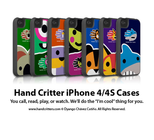
Check out the Hand Critter iPhone Cases. You call, play or watch. They'll do the "I'm cool" thing for you. See the whole collection of iPhone and other mobile cases by the Hand Critters.
Tuesday, May 8, 2012
A Pig's favorite movie
Hand Pig likes a good action movie, especially one featuring a huge angry pig running through a jungle after tourists in a jeep…wait, is that the right plot? Keep reading for all the details
Tuesday, May 1, 2012
How to become a ninja using a cereal box
New Blog Post from the Hand Critter website: Becoming a ninja, or “Shinobi” in Japanese, is no easy task. These warriors must be trained in fighting skills and stealth, among other important skills. Luckily for us, our own Hand Ninja has developed a simple system for becoming a super warrior. Keep reading for all the details.
Sunday, April 29, 2012
New Post: 50% Off t-shirts and bags sale - 50% Off t-shirts and bags saleHappy Sunday, Critter friends. We wanted to... http://ow.ly/1je8KM
Subscribe to:
Posts (Atom)